
CHROMATIC GREY SCALES
- evs702
- Mar 8, 2017
- 1 min read

YELLOW TO VIOLET
I actually really struggled with this first scale! I never remembered to mix enough paint which made it super tedious when I'd have to remix the different colours as I went. I also used the wrong white (a white that Greg hadn't pre-mixed with water) to make the lower three quarters of the scale which meant that I lost a lot of the vibrancy in the colours as I continued down the page. As a result of this the colours that are tinted white are a bit dull and grey-ish.

BLUE TO ORANGE
This was a bit easier! I tried working top to bottom rather than left to right as I had in the first one which really helped me to better manage the colours I was mixing. There are still some discrepancies especially when I began to add white to the colours. I was inconsistent with the amount of white I was using (sometimes heavy handed and sometimes light handed) which meant that many of the squares don't quite fit in with their column or row.
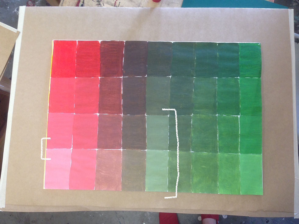
RED TO GREEN
Yay haha this was a bit smoother sailing! Still a little overhanded with the amount of white I used in a couple of squares but there were fewer errors in this piece and I got through the scale quicker than the previous two.
*the white brackets indicate the boxes that have some colour discrepancies.


Comments