
DUO-TONE COMPOSITION
- evs702
- Apr 12, 2017
- 1 min read
Today we started our duo-tone compositions and finished our photo release prints.
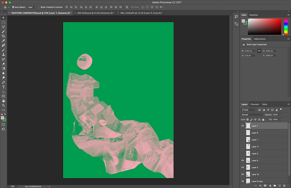
For the duo-tone compositions we used the photographs of the rubbish that we took in week one. Similar to our vector graphics, we worked in a grayscale colour space and changed the levels to get a higher contrast image. However, instead of cropping them in Illustrator, Jo showed us how to trace and select our objects in Photoshop with the magic wand tool, lasso tool and by creating paths with the pen tool. We then moved the colour space to duo-tone where we picked two contrasting Pantone colours to fill each space.
PROGRESS SHOT

FINAL
I love green because it's such a vibrant yet soothing and organic colour so I wanted to work with it in this piece. I chose baby pink as the second tone because it still has a level of contrast against such a heavy green (being a tone of red; green's complementary colour) but gave of a softer feeling than a red would have. By using a the pink l believe the work will be easier to view and won't be so jarring at a first look.


Comments