
DOUGLAS ANNAND
- week three research task
- Apr 25, 2017
- 2 min read

Douglas Annand, 1936, The Typist, various collected items on cotton material, 33.4 x 31.6cm
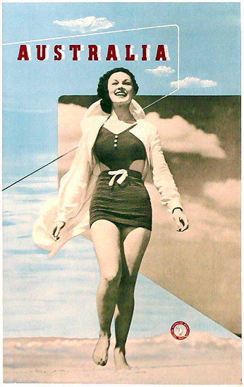

Douglas Annand & Max Dupain, 1937, Australia, colour and process lithograph, 49.1 x 30.7cm (left)
Douglas Annand, 1938, Australia's 150th Anniversary 1938. "Venetian Nights", colour offset lithograph (right)

Douglas Annand, 1962, Australia Commonwealth Games, Perth, colour offset lithograph
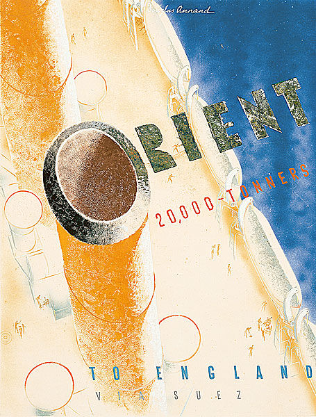
Douglas Annand, 1935, Orient 20,000 tonners, gouache
DOUGLAS ANNAND
I originally came across Douglas Annand because he was born in same town as me, Toowoomba, Queensland. I was amazed someone had made such a name for themselves in the design world despite coming from a town so peripheral to the progressive art scene happening in urban areas.
Having been employed and commissioned to design pieces for events at the Sydney Harbour Bridge and the Commonwealth Games as well as organisations such as the P&O (National Gallery of Australia 2017), it was critical that Annand’s work effectively portrayed the message he needed. To achieve this, he used many of the compositional strategies we have being looking at in class, including overlapping, tone, form, kinetic sequencing as well as contrast and line to form a focal point and thus, visual hierarchy. For example, in his advertisement for Orient Liner in 1953 (above), the viewers eye is led up the outline of the funnel to the ‘O’ shape on top. This ‘O’ becomes a part of the word ‘orient’ and is emphasised by the contrast of the green-black type against the yellow ship. The repetition of the ‘O’ shape means the viewer is drawn around the poster to these points and because the smaller ‘Os’ are the same red as the text ‘20,000 tonners’, the work is drawn together. By using a limited number of colours, like we have been doing in our vector graphics, each of the elements stand out against one another but the repetition of these colours also unites the work. Thus, the use of these compositional strategies creates a resolved, aesthetically pleasing work that gives context to the advertisement as well as clearly portraying the message.
National Gallery of Australia 2017, Douglas Annand: The art of life, NGA, viewed 24 April 2017, <https://nga.gov.au/Annand/edu.cfm>


Comments