
DIN
- evs702
- Aug 16, 2017
- 3 min read
The original “industrial-strength” sans serif design (FontFont n.d.), DIN is a prominent typeface known for its clear, narrow design. The first version of the DIN series, DIN 1451, was adapted from the typeface used by the Royal Prussian Railways in the early twentieth century.
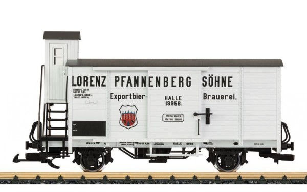
Text used on model carriage of Royal Prussian Railways
An acronym for the ‘Deutsches Institut für Normung’ (German Institute for Standardization), DIN 1451 was commissioned in 1936 for use on road and railway signage throughout Germany. Through the Second World War, the font was also used adopted by other states including protectorate of Nazi Germany, Bohemia and Moravia until its collapse in 1945. The typefaces’ popularity continued, with it later being adopted as the principle font used on German public administration. To suit this purpose, the font had to be clear and legible. Another factor was that space was often at a premium due to the limited area on signs and also that the German language is known for its especially long, compound words.


Examples of street signage in Germany and the importance of space.
Throughout and after the war, the font was commonly found German households, being used on a variety of everyday goods and items (Challand 2009), and was on German number plates until the year 2000 (Prepressure 2017). Journalist Skylar Challand writes that this process has made the DIN font family “synonymous with German design” (2009), with the Museum of Modern Art (MoMA) corroborating this, stating that it was “the official typeface of Germany” (2011). Through the 1990s, renowned German designer and typographer, Erik Spiekermann noticed that DIN 1451 had become a popular because of its form, stating “DIN...is the magic word for everything that can be measured in Germany. …this typeface has been picked up by many graphic designers who like it for its lean, geometric lines” (cited in MoMA 2014) and it being in such frequent daily use (Monotype 2014). Spiekermann suggested to Dutch designer, Albert-Jan Pool that he consider “reviving” DIN 1451 (Monotype 2014), as it was constrained by its limited number of widths and styles. Pool set to work on the font, taking some liberties with his renewal of the typeface by notably using a round dot on the ‘i’ instead of the previous square-dot design. Although a seemingly minor change, this increased visibility to the lettering when set at smaller point sizes and also improved DIN’s use in signage as it prevented confusion between the ‘l’ and ‘i’ when viewed from a distance. While the digitised version of DIN 1451 was available from Linotype, in 1995 a more extensive and versatile family of typefaces, FF DIN, was released for font foundry, Fontshop (now Monotype), making the typeface more accessible. FF DIN consists of 20 variations including a rounded version, and has arguably been the most successful remake of the type.
FF DIN has been widely adopted for commercial purposes, with printed media site, Prepressure writing that it is “more geared towards commercial applications” (2017). FF DIN has been praised for its on-screen finish with the type often being used in magazines, advertisements, online and in corporate logos (Prepressure 2017). Notably, Adidas uses the typeface in their marketing campaigns as well as Panasonic and a variety of other international corporations.

Challand, S 2009, Know your type: DIN, idsgn: A Design Blog, viewed 28 August 2017, <http://idsgn.org/posts/know-your-type-din/>.
FontFont n.d., FF DIN, Monotype Imagining Inc., viewed 1 September 2017, <https://www.fonts.com/font/fontfont/ff-din/story>.
Museum of Modern Art 2011, FF DIN, MoMA, viewed 28 August 2017, <https://www.moma.org/collection/works/139323>.
Prepressure 2017, DIN, viewed 28 August 2017, <https://www.prepressure.com/fonts/interesting/din>.


Comments