
ANATOMY OF TYPE PT. 1 & BODIES OF TEXT
- evs702
- Aug 17, 2017
- 2 min read
Today we started our theory component of typography by looking at its personalities and how it functions as the vessel for written language.
TYPE CRIMES:
- DO NOT stretch/distort type vertically or horizontally.
- DO NOT just click the italic/bold button. Pick a typeface from the type family, they are visually and mathematically engineered.
- Use a large difference in scale of type to provide effective emphasis, minimal difference in scale is too tentative, looks like a mistake.
- Be weary of using similar typefaces from the same type families, they often look too similar.
KEY TERMS:
- Kerning: the adjustment of space between two letters to make the text more visually pleasing.
- Leading: the distance from the baseline to the top of the following line of type.
- Alignment: the justified, centred or ragged form of paragraphs and bodies of text.
KEY POINTS:
○ Do not mistake legibility for communication.
○ Sans-serif and serif fonts collaborate well.
○ Be cautious of Y, L, A, W & T and they contain negative space - This could be come problematic for things like drop caps.
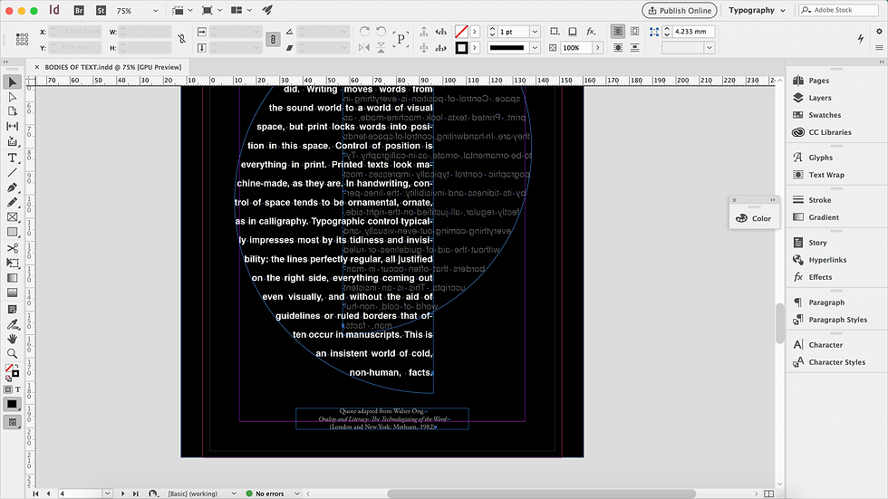
After our typography theory lectures we worked on designing different bodies of text in Garamond and Helvetica typefaces.
I thought this task would be quite straight-forward but it was actually quite challenging. I am so used to just seeing text whacked straight on a page so it was really interesting to try and push myself to find new layouts that worked with the font you were using.

The only time I had ever used InDesign before was only for experimental purposes, trying to find my way around the software. Therefore, having Jo on standby and teaching us how to use the different tools was really helpful in constructing the compositions.
One of the main things I got from feedback from Jo was the importance of negative space in emphasising the text. I like to fill the whole page with large text, which isn't necessarily the way to make sure people can read the text.


Comments