
MONOGRAMS
- evs702
- Aug 19, 2017
- 1 min read
Today we started work on creating our own monogram that effectively captured our personality.
First we had to decide on what sort of typeface best embodied us. I went for some simple sans-serif fonts such as Franklin Gothic, Avenir Next, DIN Alternate and also Braggadocio for fun. The next part was a bit deciding as i needed to decide to use LS (Lizzy Snow) or ES (Elisabeth Snow). I hardly ever go by Elisabeth but the E and S seemed to work really well together. The consistency in height, shape and even form made the letters much more compatible than the L and the S.

I had settled on the the entwined E and S in Avenir and then had a bit of a brainwave with the Braggadocio font, noticing that the E and the S had a very similar form. Thus my final monogram was born. :)
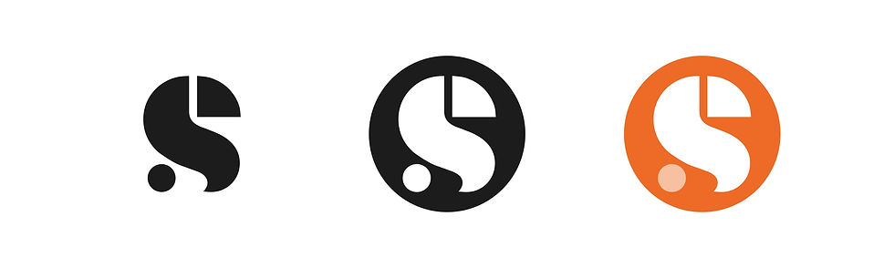
Looking at it now, I'm not completely sure if the monogram is recognisably an E and an S but I believe the final composition was more resolved than the others I was working on above.


Comments